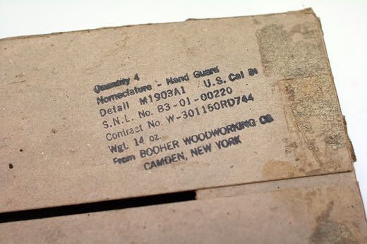
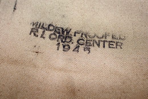
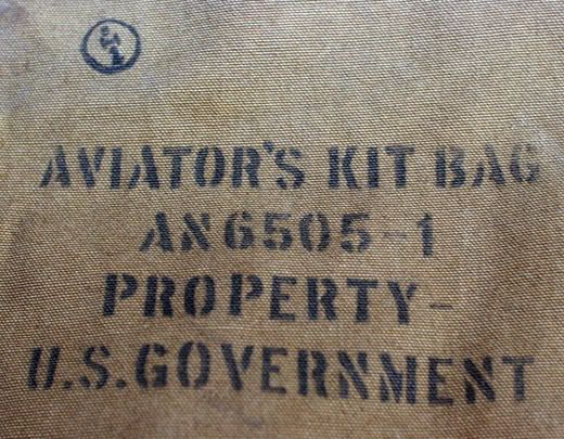
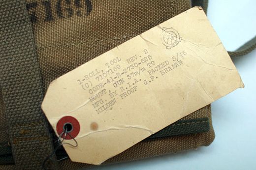
I've said it before, I'll probably say it again. I love when you come across something that is cool and timeless because it wasn't designed to be something more than it was in the first place. What? The stamps, tags and stickers on these products weren't made to look cool and vintage. They weren't designed to look utilitarian, they just were. The people that designed these didn't argue with Sullivan and Van Der Rohe about form and function, in fact, they probably had never heard of the guys, or cared to. These little bits of paper and ink marketing served a purpose. They informed men and women of the contents, materials and uses of the items, nothing more. There is something so pure about getting to the root of a design trend, and seeing the original inspiration for an entire aesthetic. These are the real deal.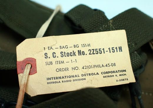


skip to main |
skip to sidebar


INSTAGRAM


A TIME
Not for this. Not for that. For everything in between. For work. For avoiding work. For inspiration. For a resource. For entertainment. For a minute. For an hour. The good, the bad, and yes, even the ugly. In a world that has no time for anything, there is always a time to give, and every now and again... a time to get.
I'm a photographer and these are the things I think about...
MY PORTFOLIO
EMAIL ME...
GOOD THINGS
- 10 ENGINES
- A CONTINUOUS LEAN
- ALONG FOR THE RIDE
- BLACK LODGES
- BOMBER HARRIS
- DAY 19
- DEFGRIP
- DEUS EX MACHINA
- ENDLESS ME
- GODSPEED
- HABITUALLY CHIC
- HUFNAGEL CYCLES
- INVENTORY
- JAKE DAVIS
- KYLE LIGHTNER
- MAN ON THE MOVE
- MOST EPIC
- MOTORING CON BRIO
- MYLES HENRY
- NOBODY AT THE WHEEL
- POLER
- PULL UP AND OUT
- RESTLESS TRANSPLANT
- SARTORIALLY INCLINED
- SHAKAS AND SINGLE FINS
- THE BRICK HOUSE
- THE IMPOSSIBLE COOL
- THE MOTART
- THE SELVEDGE YARD
- VALET
- WERK CREW
IN THE PAST
- December 2015 (1)
- March 2014 (1)
- February 2014 (12)
- September 2013 (1)
- July 2013 (4)
- June 2013 (16)
- January 2013 (1)
- September 2012 (11)
- June 2012 (5)
- May 2012 (2)
- April 2012 (5)
- March 2012 (3)
- February 2012 (8)
- January 2012 (3)
- December 2011 (6)
- November 2011 (1)
- October 2011 (5)
- September 2011 (7)
- August 2011 (4)
- July 2011 (7)
- June 2011 (6)
- May 2011 (9)
- April 2011 (8)
- March 2011 (18)
- February 2011 (22)
- January 2011 (26)
- December 2010 (15)
- November 2010 (16)
- October 2010 (16)
- September 2010 (26)
- August 2010 (35)
- July 2010 (23)
- June 2010 (30)
- May 2010 (15)
- April 2010 (24)
- March 2010 (27)
- February 2010 (16)
- January 2010 (22)
- December 2009 (22)
- November 2009 (22)
- October 2009 (26)
- September 2009 (28)
- August 2009 (28)
- July 2009 (38)
- June 2009 (28)
- May 2009 (36)
- April 2009 (42)
- March 2009 (56)
- February 2009 (84)
- January 2009 (68)
- December 2008 (10)
Search A Time To Get...